Creating themes in Resource Editor
Themes can be easily created and modifed in Resource Editor by setting the selectors and the theme resources to the desired values to produce an attractive UI.
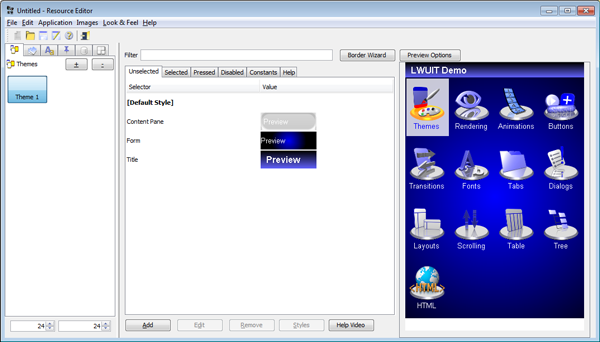
Figure: Example theme in Resource Editor
To modify the theme, choose a selector on the left side and click the Edit button. You can add new selectors using the "Add" button in the theme. To modify an existing selector, select it in the table and either double click or press the "Edit" button.
Adding a new theme
This section describes how to add a new theme using the Resource Editor.
-
In Resource Editor, select the Themes tab on the left, and click the + button to open the New Theme window. (Note that a resource bundle can contain more than one theme.)
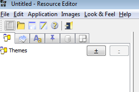
Figure: Adding a new Theme from the Themes tab
-
In the New Theme window, select "Blank" from the Template combo box. Click OK to create the new theme.
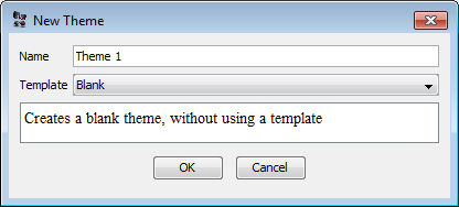
Figure: New Theme window
-
The UI area in the center of Resource Editor shows the Unselected tab by default. Click the Add button at the bottom of the UI area.
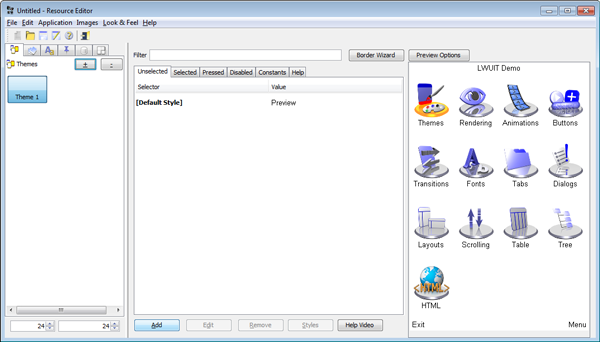
Figure: Empty theme
-
The Add window opens.
Select Form from the Component combo box at the top of the Add window.
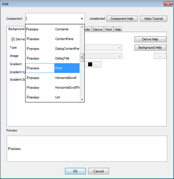
Figure: Add window - Using the Component combo box
-
In the Background tab, uncheck Derive.
From the Type dropdown, choose GRADIENT_RADIAL.
Type ff into the left gradient colour (to select a blue to black radial gradient).
Type 2 into the gradient Size spinner to double the size of the gradient.
Click OK to save your changes and close the window.
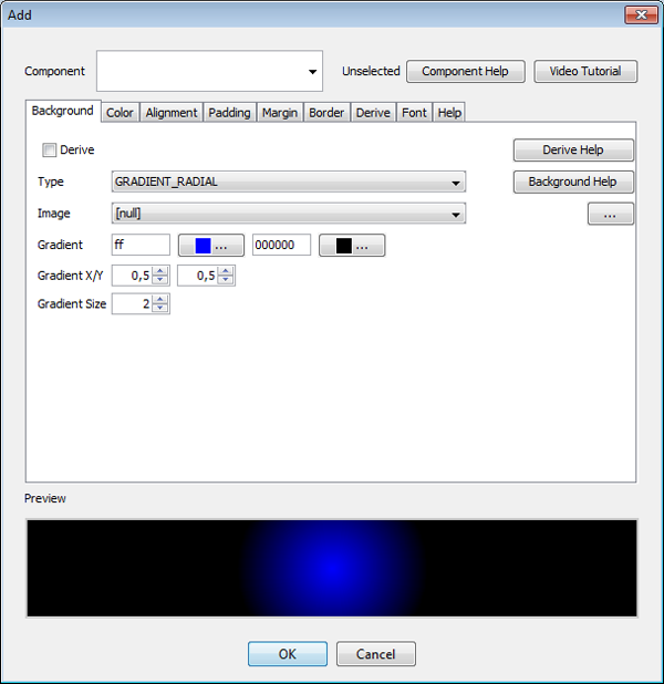
Figure: Add window - Using the Background tab to create a radial gradient
-
Click the Add button again.
-
In the Add window, select Title from the Component combo box.
-
Select the Background tab.
- Uncheck Derive.
- In the Type combo box, select GRADIENT_LINEAR_VERTICAL.
- In the Gradient input field on the right, type 6363ff to select a light blue colour.
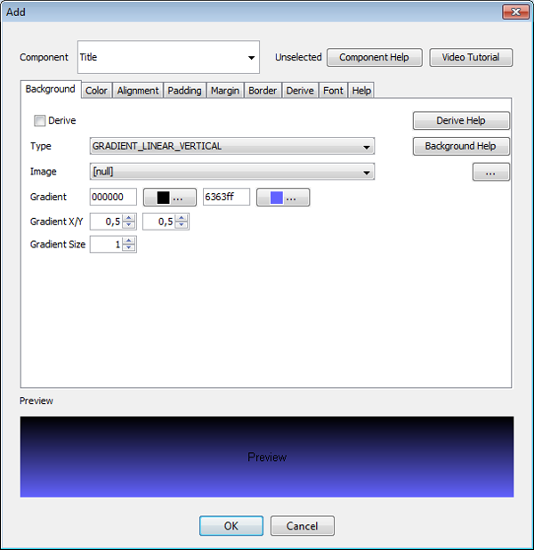
Figure: Add window - Using the Background tab to create a vertical linear gradient
-
Select the Color Tab.
- Uncheck the Derive Foreground checkbox.
- Type ffffff into the Foreground field.
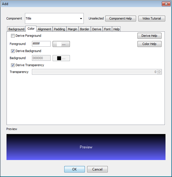
Figure: Add window - Using the Color tab
-
Select the Alignment tab.
- Uncheck the Derive checkbox and make sure Left is selected in the Alignment combo box.
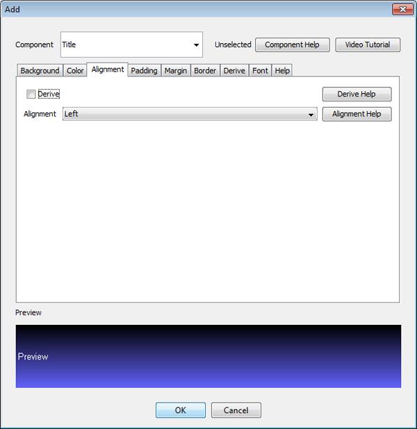
Figure: Add window - Using the Alignment tab
-
Select the Padding tab.
- Uncheck the Derive checkbox.
- Type 10 in the Left and Right fields, and type 5 in the Top and Bottom fields.
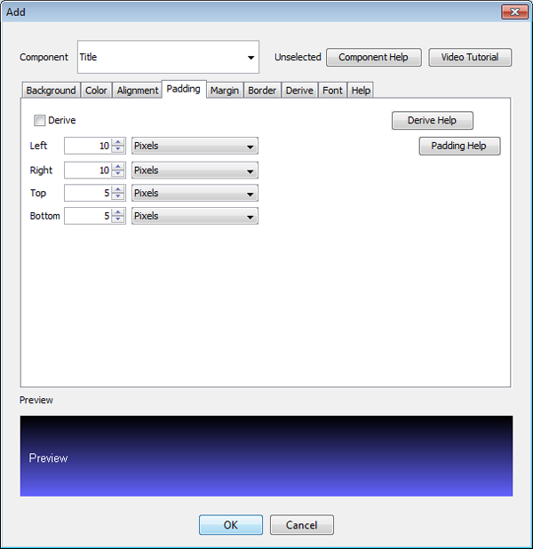
Figure: Add window - Using the Padding tab
-
Select the Font tab.
- Uncheck the Derive Font check box.
- Select BOLD in the center combo box and LARGE in the combo box on the right.
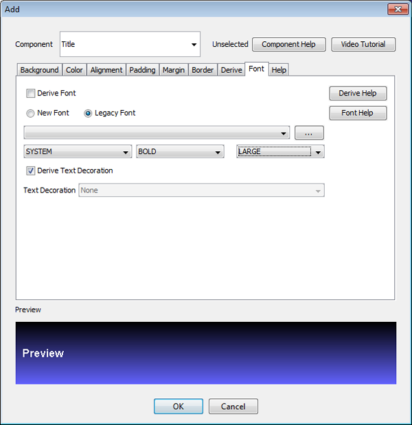
Figure: Add window - Using the Font tab
Click OK to save your changes and close the window.
These steps will create a left-aligned spaced large title that uses white bold text on a vertical gradient background.
-
-
In the main UI's Unselected tab, double-click the [Default Style] selector to open the Edit window.
-
In the Edit window, select the Color tab.
Uncheck Derive Foreground and type in ffffff to make the default text color white.
Uncheck Derive Transparency and type 0 in the Transparency field to make components transparent by default.

Figure: Edit window - Changing default colours for Unselected
Click OK to save your changes and close the window.
-
In the main UI area, choose the Selected tab, then double-click the [Default Style] entry to open the Edit window.
-
In the Edit window, select the Color tab.
Uncheck Derive Foreground.
Type in ff to make the foreground blue.
Uncheck Derive Transparency.
Type 200 in the Transparency field to make the selection colour blend nicely.
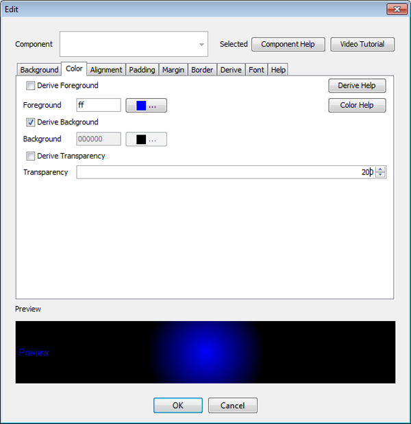
Figure: Edit window - Changing default colours for Selected
Click OK to save your changes and close the window.
-
In the main UI area, click the Border Wizard button near the top of the UI area. Border Wizard window opens.
-
In the Border Wizard window's Create Image tab:
-
In the Width and Height spinners, type 200. These set the size of the image.
-
In the Thickness spinner, type 4. This sets the border thickness.
-
In the Arc Width and Arc Height fields, type in 30.
-
In Color A and Color D fields, type in ffffff. In Color B and Color C fields, type in 9f9f9f. This creates a reverse border gradient which strengthens a sense of depth.
-
In the Opacity spinner, type 130 to make the image translucent.
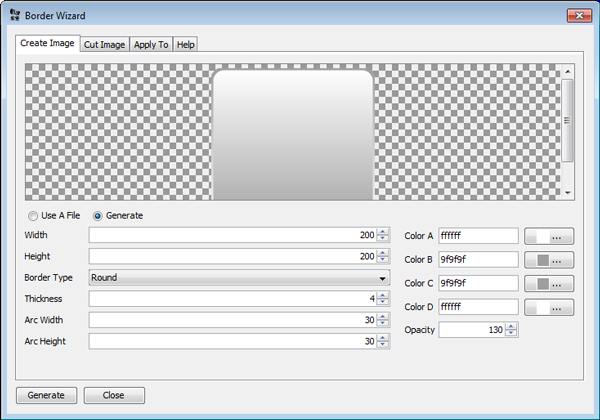
Figure: Border Wizard window - Create Image tab
-
-
Select the Cut Image tab. Here we can split the image in 9 parts.
-
Type 100 in the Top spinner and 90 in the Bottom spinner to define the sizes of the top and bottom areas.
-
Type 25 in the Left and Right spinners to define the sizes of the left and right areas.

Figure: Border Wizard window - Cut Image tab
-
-
Select the Apply To tab.
-
In the Component field, type Content Pane.
-
In the Style combo box, choose Unselected.
-
Click the Add button on the Right. This populates the Applies To area.
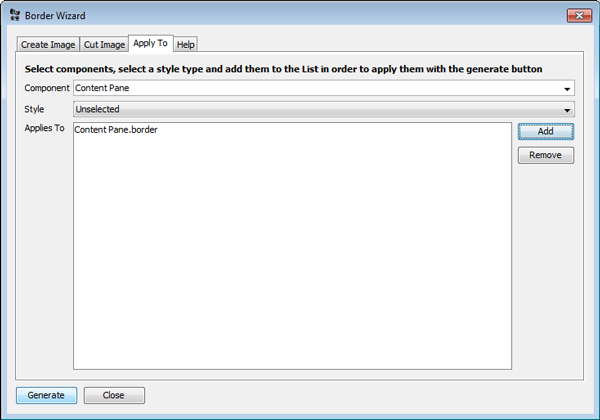
Figure: Border Wizard window - Apply To tab
Click the Generate button at the bottom, and close the Border Wizard.
-
-
In the main UI area, choose the Unselected tab, then double-click the Content Pane style entry to open the Edit window.
-
In the Edit window, select the Padding tab.
-
Uncheck Derive.
-
Input 5 in Top, Bottom, Left, and Right spinners.
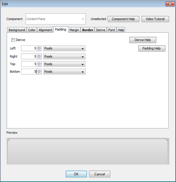
Figure: Edit window - Adjusting the padding of the Content Pane component
-
-
Select the Margin tab.
-
Uncheck Derive.
-
Input 14 in Top, Bottom, Left, and Right spinners. This will provide some spacing around the border to accentuate its effect.
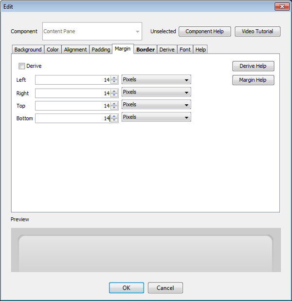
Figure: Edit window - Adjusting the margin of the Content Pane component
Click OK to save your changes and close the window.
-
-
Figure 18 shows the final result.

Figure: New theme
Adding a theme from a template
To gain a deeper understanding of themes, add a theme from a template and review its settings. In the Themes tab on the left, click + to add a new theme. From the template combo box, choose nokia_touch_type_theme and click OK.
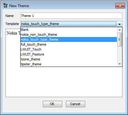
Figure: Creating a new theme based on an existing theme (template)
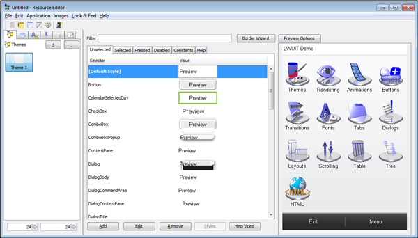
Figure: Touch and type theme selectors and preview
You can gain deeper understanding of the selector concepts from the Theming and styling section.
Modifying Theme Entries
A theme entry is comprised of a UIID and the attributes modified for the specific UIID. The hardest part in building a theme is understanding the component names for the entries within the UI.
When pointing at the UI preview on the right, a tooltip pops up indicating the UIID of the component you are pointing at; however, this might not work as expected for list renderers (who are no longer there) or for components that are underneath other components (for example, a container that has components on top of it.)
When adding a new entry (using the Add button at the bottom of the screen), the combo box at the top highlights in bold the UIIDs that are present in the current screen. This allows discovery via trial and error.
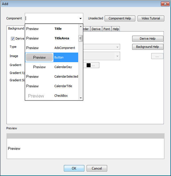
Figure: Component UIIDs
Notice that every attribute within this dialog has a Derive check box associated with it. The default behaviour of adding a new theme entry is to derive from the base style. You need to explicitly indicate that you are interested in modifying a specific attribute. This allows the theme to remain efficient by reducing the amount of "noise" within the theme and also allows inheritance to work properly.
LWUIT style inheritance is built in stages:
-
LWUIT has constant "sensible defaults" for some component behaviours (for example, Buttons have a border style by default.)
-
Every style type has the [Default Style] global scope where you can define your own defaults for components (although this will not replace LWUIT's built-in defaults, such as the button borders.)
-
Individual styles can use the Derive tab to define explicit inheritance hierarchy from a specific style UIID to reuse definitions made for one component. This is very useful when you have multiple style types, because the Selected, Pressed, and Disabled component styles can derive from the Unselected style of a component.