Tab

Summary:

  • Tabs are an alternative to using CategoryBar.

  • CategoryBar should be used whenever possible and is preferred over tabs.

  • Tabs allow text or icons.

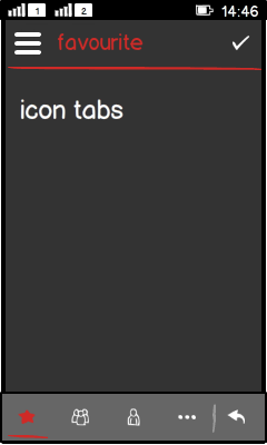
  • Behaviour and look-and-feel of tabs with icons is identical to CategoryBar.

LWUIT

Related design guidelines

Basics and formats

Figure: Tabs with icons

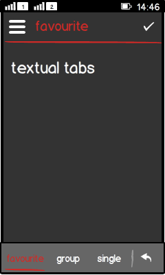
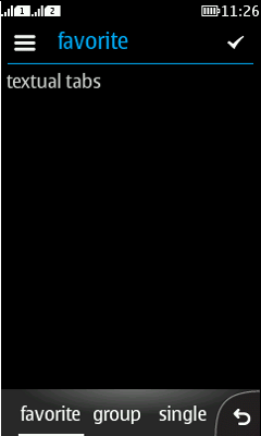
Figure: Tabs with text

  • Tabs are used for:

    • Replacing a CategoryBar in case text is needed instead of icons.

      • Tabs can also be used to show icons, but this is not recommended, CategoryBar should always be used when possible.

  • Limitations:

    • Text tabs are usually limited to three tabs in the tab bar.

    • Font must be at least 14 pt.

    • No category bar extension view as found in CategoryBar.

    • No scrolling left/right to add more items.

    • Do not use more than one row of tabs.

    • Do not place any actions in the tab bar.

  • Positioning:

    • Full-touch: at the bottom of the view.

    • Touch and type: preferably not used at all; if used, place at the top of the view.

    • Non-touch: do not use.

  • Interaction:

    • Highlight the currently active tab.

    • Always one tab must be active.

    • Tab bar disappears with drill down.

Platform specific features

Full touch

Touch and type

Non-touch

Descriptions

Figure: View in full touch

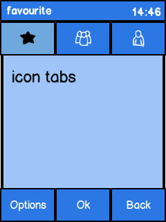
Figure: View in touch and type

Do not use tabs in non-touch.

  • Full touch:

    • Can replace CategoryBar.

  • Touch and type:

    • Place the tab bar at the top of the view.

    • Avoid a "double bar" at the bottom of the view.

    • Not recommended due to limited screen real estate.

  • Non-touch:

    • Do not use tabs to avoid any navigation problems with the left/right navipad keys.

    • Also the native style does not use any tab navigation.