Button
The Button component enables the GUI developer to receive action events when the user focuses on the component and clicks. In some devices a button might be a more practical and usable solution than a command option. Button is the base class for several UI widgets that accept click actions. It has three states: rollover, pressed, and the default state. It can also have ActionListeners that react when the Button is clicked.
To get the user clicking event, you must implement an ActionListener, which is notified each time the user clicks the button. The following code snippet creates an action listener and changes the text on the button when the user clicks it:
final Button button  = new Button("Old Text");
button.addActionListener(new ActionListener() {
    public void actionPerformed(ActionEvent evt) {
        button.setText("New Text");
    }
});
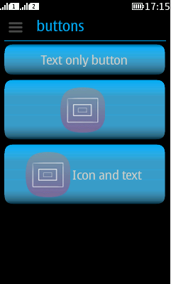
Button extends Label, so you can create three type of buttons: text only button, image only button, or image and text button.

Figure: Button with text, Button with icon, and Button with text and icon