Label
The Label widget can display a single line of text and/or an image and align them using multiple options. If you need to create a component that displays a string, an image, or both, you should use or extend Label. If the component is interactive and has a specific state, a Button is the most suitable widget (instead of a label). For multiple line texts, you can use TextArea.
To create a text label:
Label textLabel = new Label("I am a Label"); // for a text label
To create an image for an icon label:
Image icon = Image.createImage("/images/duke.png");
Label imageLabel = new Label(icon);
Labels can be aligned to one of the following three directions: CENTER, LEFT, RIGHT. LEFT is the default. You can change the alignment by calling setAlignment method of the Style object associated to the Label:
Label label = new Label(“I’m aligned to the right”);
label.getStyle().setAlignment(Label.RIGHT);
You can set the vertical alignment by calling the setVerticalAlignment method of the Label class. The accepted values are TOP, BOTTOM or MIDDLE.
setVerticalAlignment(int alignment);
In addition, the text can be aligned relative to the image position. Valid values are TOP, BOTTOM, LEFT, RIGHT, where the default is RIGHT. To update the text position relative to the image, use:
setTextPosition(int alignment);
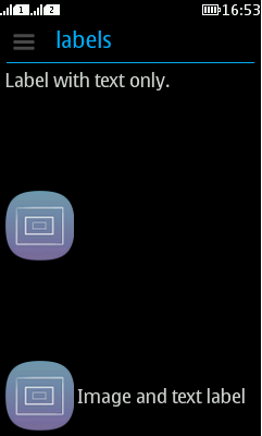
Figure 1 displays three types of labels with text to icon alignment position of RIGHT. The container is divided into three rows, and the label in each row is as wide as possible.

Figure: Label with text, Label with icon, and Label with text and icon
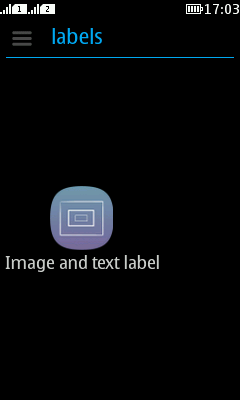
Figure 2 shows relative alignment, with the label below the icon.

Figure: Text aligned to icon with position value BOTTOM
Ticker
Label (and all its subclasses) includes ticker support. A ticker scrolls the content of a long label across the screen. Ticker ability in labels is usually indicated by displaying three dots "..." after the end of the label. When the label (button, checkbox, etc.) receives focus, these three dots disappear and the label starts animating like a stock ticker.
A ticker can be started explicitly using a call to startTicker or stopTicker in Label. It can also be prevented by invoking setTickerEnabled(false). To prevent the three dots from appearing at the end of labels or components that support tickering, use setEndsWith3Points(false).