Progress indication

Summary:

  • Currently, progress indicator is derived from slider.

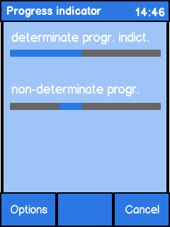
  • Determinate progress indicator:

    • Indicates the progress of a process for which overall time or amount of work can be predicted.

    • Is visualised with a filling bar.

    • Technically derived from a non-interactive slider.

  • Indeterminate progress indicator:

    • Indicates a process for which overall time or amount of work cannot be predicted.

    • Shows that the device is busy.

    • Is visualised with a block travelling horizontally through a bar.

  • If there is process running longer than 3 seconds:

    • There must be a way to abort the process.

    • Include a "Cancel" button into the view.

LWUIT

Related UI design guidelines

Basics and formats

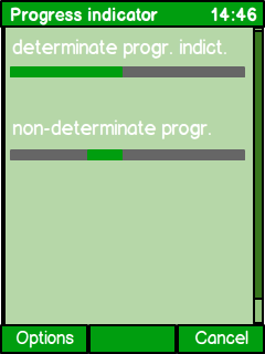
Figure: Determinate progress indicator

Figure: Indeterminate progress indicator

  • Determinate progress indicator:

    • Indicates the state relative to the entire process duration.

    • Full process duration can be predicted.

    • Visualised with a filling bar.

    • Usually requires a cancel button.

  • Indeterminate progress indicator:

    • Shows a visual feedback that the device or application is busy.

    • Is visualised with a block travelling horizontally through a bar.

    • Can be used if the process is very short (less than 3 seconds).

    • Can be used if the process duration or the process work cannot be predicted.

    • Should not be used if the process duration could be longer than 10 seconds. In this case:

      • Look for other strategies to predict the process, e.g. work units, or

      • terminate the process and inform what is going wrong, e.g. "busy network".

    • If the wait can last longer than 3 seconds, the view must have a "Cancel" button.

  • Structure:

    • Determinate progress indicator is a modified slider.

    • Indeterminate progress indicator is a rotating image.

It is not always possible to predict a process, e.g. when trying to log into a service. The server might not respond immediately, or there could be too much network traffic. However, if your process might take longer than 10 seconds, you must find a way to indicate the process as a determinate process. Try the following approaches:

  • Show work units instead of time. You may know the file size, but the download rate varies. In this case it is a good solution to show the received data amount in comparison to the total file size.

  • Indicate a timeout. If you are waiting for a server to answer, show a the process as actual timeout process. If the server does not answer within a certain time, e.g. 10 seconds, abort the process and help the user to solve the problem. For example: "WLAN doesn't connect, try mobile data connection instead. Be aware of possible additional costs."

  • Do not use spinner in case you cannot predict the waiting time at all.

  • Always include a Cancel button if your process takes longer than 3 seconds.

Platform specific features

Full touch

Touch and type

Non-touch

Descriptions

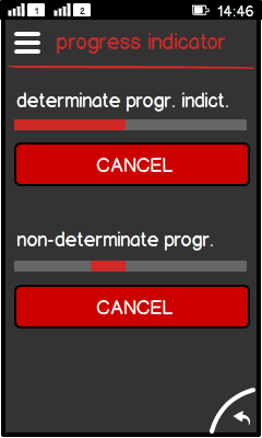
Figure: Individual cancel option in full touch

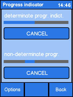
Figure: Individual cancel option in touch and type

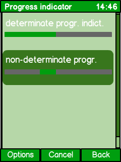
Figure: Individual cancel option in non-touch

  • Full touch and touch and type:

    • Cancel as a button for each item.

  • Non-touch:

    • Cancel in the middle softkey. Pressing it stops the highlighted process.

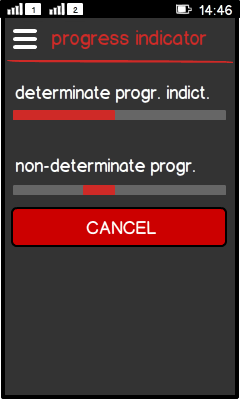
Figure: Shared cancel option in full touch
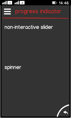
Figure: Shared cancel option in full touch after pressing "Cancel"

Figure: Shared cancel option in touch and type
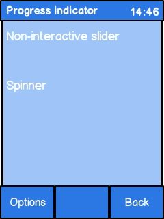
Figure: Shared cancel option in touch and type after pressing "Cancel"

Figure: Shared cancel option in non-touch
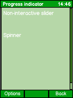
Figure: Shared cancel option in non-touch after pressing the "Cancel"

  • Full touch:

    • Cancel as a button in the view.

  • Touch and type and non-touch:

    • Cancel in the right softkey.

    • Pressing it:

      • stops all processes,

      • changes "Cancel" to "Back".