Slider and seek bar

Summary:

  • Currently, most slider and seek bar formats are custom solutions built around the slider component.

  • Slider allows people to set a value within a continuous range.

  • Possible to add:

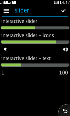
    • Start and end icon.

    • Start and end text.

  • Seekbar is a slider which automatically updates its current value.

  • Tooltip with current value appears:

    • In full touch and touch and type, after a press on the handle.

    • In non-touch, when focusing the slider or seekbar item.

LWUIT

Related design guidelines

Note:

To distinguish between Slider/Seekbar and progress indicator, it is recommended to add a handle to the slider. However, this is currently a custom solution.

Basics and formats
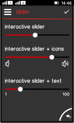
Figure: Different sliders

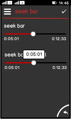
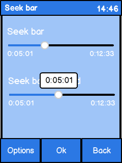
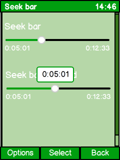
Figure: Seek bars

  • Sliders are used for:

    • Displaying a value within a continuous value range.

    • Setting a value within a continuous value range.

  • Seekbars are sliders which:

    • Update the handle position and handle value automatically according to the current state, e.g. elapsed time.

    • Behave otherwise like sliders.

  • Components:

    • Slider with a handle (this is the default slider UI component).

    • Tooltip:

      • Shows only after press down (touch), or when slider item is focused (non-touch).

      • Displays the current value of the handle position.

      • For touch phones, the tooltip should disappear after finger lift with a delay (1,5 seconds).

    • Optional title.

    • Optional icons or characters to show min and max values:

      • Icons indicate a large and a small value of the otherwise same metaphor.

      • Bounding box is 36px x 36px.

      • Focal zone is 16px x 16px.

      • Min text is left aligned, max text is right aligned.

      • Min/max text size is 14pt light.

  • Interaction:

    • Slider must have a default value.

    • Slider must always show a value.

    • Minimum value can be different from 0.

    • Full touch and touch and type:

      • Press on the handle brings the tooltip to foreground.

      • Tooltip bubble and tooltip value follow the handle.

      • Tooltip disappears after timeout.

    • Non-touch:

      • Item requires focus.

      • Navi pad left/right keys decrease/increase the value.

    • Accuracy (technical possibility) is pixel perfect, i.e. 208 pixels result in 208 possible values for a slider.

    • Precision (based on user's interaction with the phone) is expected to be much lower, e.g. 10-20 discreet values for a horizontal slider in portrait orientation.

  • Structure:

    • Slider is a subclass of Label.

Note:
  • Do not jump between values, e.g. do not use 1, 3, 5. Only use continuous values like 1, 2, 3.

  • Do not use non-numerical values like: cat, dog, mice.

Platform specific features

Full touch

Touch and type

Non-touch

Descriptions

Figure: View in full touch

Figure: View in touch and type

Figure: View in non-touch

  • Full touch and touch and type:

    • Tooltip comes to foreground when the user taps on the slider handle.

    • Handle, tooltip, and tooltip value follows the finger.

    • No keypad support foreseen.

  • Non-touch:

    • Tooltip comes to foreground when the user sets focus on the slider item.

    • Navipad left/right decreases/increases the value.

    • It is recommended to add functionality where the value changes are done dynamically; the longer the key press, the faster the value change.

    • Do not allow any panning left/right in the same view, since the navipad is reserved for decrease/increase.

    • It is recommended to add functionality that allows the user to change the value by typing with the keyboard.

    • Typing requires automatic formatting for special formats like time.

    • Middle softkey is not required for this component.