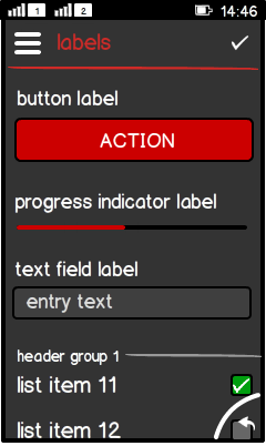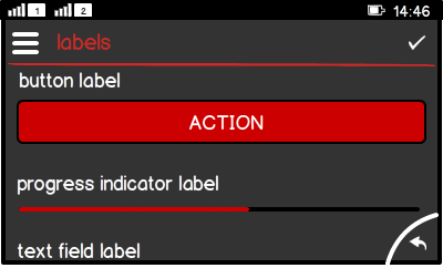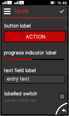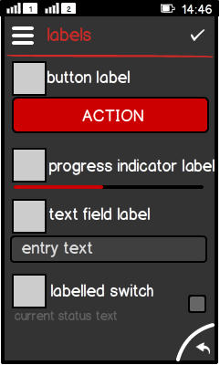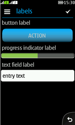
Label

Summary:

  • Single line of:

    • Text, or

    • image and text.

  • Not interactive (use button instead).

  • Cannot display a certain state (use button instead).

  • Cannot expand to multiple lines (use text area instead).

LWUIT

Related design guidelines

Basics

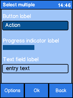
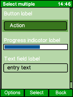
Figure: Various UI components with label in portrait

Figure: Various UI components with label in landscape

Interaction:

  • Only for displaying text.

  • No further interaction.

  • If further interaction is needed, use a Button instead.

Labels can appear in:

  • List.

  • Container.

  • Form.

  • Tabbed pane.

Structure:

  • Label is a component.

  • Label has the subclass Button.

Formats

Component title

Figure: Various UI components with title

Figure: Various UI components with title and title icon

  • Located above the component.

  • Text is left aligned for left-to-right languages.

  • Icon:

    • Optional.

    • Left aligned.

    • Use always with text.

    • If used, use with all titles in the view.

Group header, standard

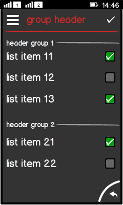
Figure: 2 groups separated with group headers (standard)

  • No ready-made component available.

  • Line is not available by default.

  • Text is left aligned.

  • Line can be an image and is right aligned.

Group header, time stamp

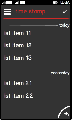
Figure: Different dates separated by group headers (time stamp)

  • No ready-made component available.

  • Line is not available by default.

  • Text (time stamp) is right aligned.

  • Line can be an image and is left aligned.

Note:

Tickering inside a label is not recommended. If you need a ticker component, use LCDUI's Ticker in Canvas.

Platform specific features

Full touch

Touch and type

Non-touch

Special features

Figure: View in full touch

Figure: View in touch and type

Figure: View in non-touch

  • Full touch uses different typography rules:

    • Component title is all lower case.

    • Group header is all lower case.