Button

  • Basics for touch:

    • Shows touch down feedback.

    • Triggers on touch release.

  • Basics for non-touch:

    • Not recommended for non-touch use.

    • Requires focus or softkey linkage.

    • Triggers on key down.

  • Formats:

    • Textual.

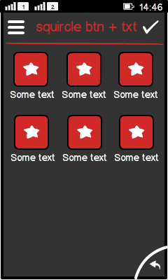
    • Squircles with icon and label below.

  • Platform specific features:

    • Full touch uses different typography rules.

LWUIT

Related design guidelines

Basics

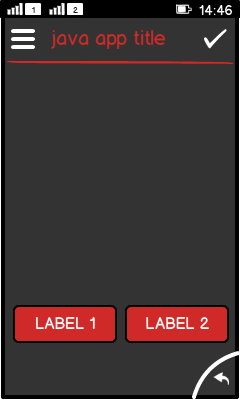
Figure: View with 2 buttons in a row

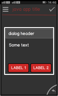
Figure: Dialog with buttons

  • The arrangement of buttons is tied to the layout:

    • BorderLayout.

    • BoxLayout.

    • GridLayout.

    • Other layouts are possible, but they do not match Series 40 look and feel.

  • Touch screen phones:

    • Indicate touch down and touch release.

    • Action is on touch release.

    • Drag-away from the button dismisses the action related to the button.

  • Non-touch phones:

    • Not recommended for non-touch use.

    • Lists, options menu and softkeys are preferred.

      • Interaction paradigms are fundamentally different in non-touch phones.

      • User expects commands from lists, menus and softkeys.

      • Navigating to a button many times does not feel to be the most clever solution (being a simple port from a touch version).

      • Buttons might become hidden in some screens (please note, there are different screen resolutions available in non-touch phones).

    • Button requires a focus or a direct link to a softkey.

    • Action on key down.

    • No possibility to dismiss a key down (equivalent to touch down event on touch phones).

  • Structure:

    • Button is a subclass of label.

    • Label is a subclass of components.

Formats

Textual buttons

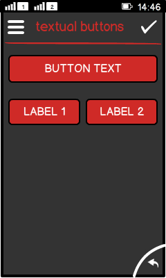
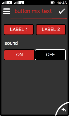
Figure: Textual buttons in portrait view

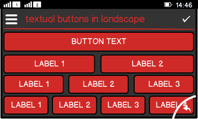
Figure: Textual buttons in landscape view

  • Text is centered by default. Do not left or right align, as this does not match the Series 40 look and feel.

  • Do not use more than:

    • 2 buttons in a line in portrait.

    • 4 buttons in a line in landscape (where applicable).

  • For localisation, allow up to 50% of additional text space when using English text as source text.

Squircle buttons

Figure: Squircle buttons with label in portrait view

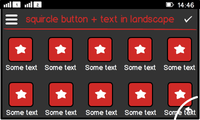
Figure: Squircle buttons with label in landscape view

  • Use "squircle" shape for single buttons with icon.

  • Add a text label below the squircle.

  • No text in squircle.

  • Only the squircle reacts to the press down, not the label.

  • Do not use more than:

    • 3 squircle buttons in a line in portrait.

    • 5 squircle buttons in a line in landscape (where applicable).

Button group

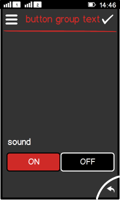
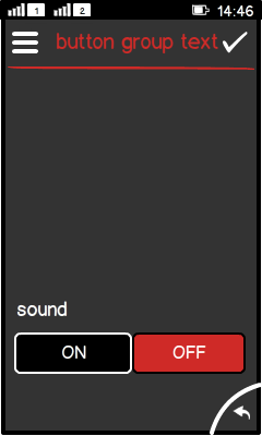
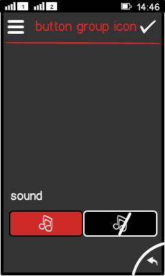
Figure: Grouped buttons with textual buttons

  • No ready-made solution available yet.

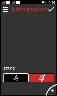
  • Should be clear opposite of each other; for example, yes-no, on/off.

  • Always one button selected.

  • Active state is highlighted.

  • Button can show text or icon.

Figure: Grouped buttons with icon buttons


Inline button

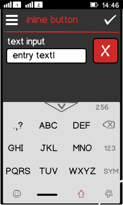
Figure: Button next to text input field to clear the field

  • Custom component.

  • Button is right aligned for left-to-right languages.

  • Adds functionality to text field.

  • Could be used, for example, to clear a text field, since the keypad does not offer a "clear all" key. This requires adding logic into the ActionListener of the button.

  • Must have clear borders for touch.

  • Not recommeneded for non-touch due to difficulties in accessing this button.

Platform specific features

Full touch

Touch and type

Non-touch

Special features

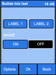
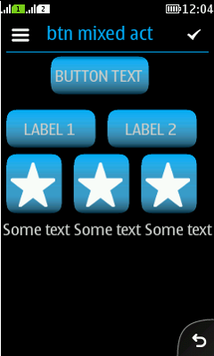
Figure: View in full touch

Figure: View in touch and type

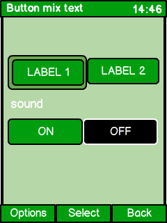
Figure: View in non-touch

  • Event trigger:

    • Touch triggers on screen release.

    • Non-touch triggers on button down.

  • Non-touch:

    • Requires a focus on the button.

    • "Select" in the middle soft key.

    • Button group should have only 2 buttons.

    • Entire button group gets the focus.

    • Pressing the MSK toggles between the 2 grouped buttons.

    • Do not use "inline" buttons due to navigation difficulties.

  • Full touch uses different typography rules:

    • Softkeys (Options, Back, and primary action MSK) become icons.

    • Button text is all caps.

    • Button label is all lower case.