STEW: defining the HTML and CSS structure
This section illustrates how to create the basic HTML and CSS structure for a widget.
Creating widget views
The content div element in the main.html file is a container for all the widget views. Each view is also a div element that is embedded as a child element of the content element. The views are hidden through the hidden CSS style and shown dynamically by the JavaScript code that runs the widget logic. Each child div (login, update_status, search, and settings) contains view specific elements.
<html>
<body>

<div id="container">


	<!-- ***** -->
	<!-- TITLE -->
	<div id="top_bar">
        <table cellspacing="0" class="top_table">
            <tr>
                <td class="top_button">
			<a id="button_logout" href="#" class="button hidden"></a>
                </td>
                <td class="top_title"><div class="stew_title"></div></td>
                <td class="top_button">
			<a id="button_exit" href="#" class="button red hidden"></a>
                </td>
            </tr>
        </table>
	</div>	 <!-- end of 'top_bar' -->

	<div id="content">

	<!-- ***** -->
	<!-- LOGIN -->
	<div id="login" class="hidden">
	</div> <!-- end of 'login' -->

	<!-- ************* -->
	<!-- UPDATE STATUS -->
	<div id="update_status" class="hidden">
	</div> <!-- end of 'update_status' -->

	<!-- ****** -->
	<!-- SEARCH -->
	<div id="search" class="hidden">
	</div> <!-- end of 'friends_status' -->

	<!-- ******** -->
	<!-- SETTINGS -->
	<div id="settings" class="hidden">
	</div> <!-- end of 'settings' -->

		</div> <!-- end of 'content' -->

	<div id="menu_strip" class="buttons_bottom hidden">
		<div id="button_container_update" class="button_container"><a id="button_update" class="button_bottom" href="#">Update</a></div>
		<div id="button_container_search" class="button_container"><a id="button_search" class="button_bottom" href="#">Search</a></div>
		<div id="button_container_settings" class="button_container"><a id="button_settings" class="button_bottom" href="#">Settings</a></div>
	</div>

</div> <!-- end of 'container' -->

</body>
</html>
Creating a title bar
The top_bar div element specifies the title bar for the widget. It contains the widget title and two buttons: Logout and Exit.
For more information about how to use JavaScript to implement the functionality of the buttons, see STEW: adding JavaScript to drive the widget logic.
Creating the Login view
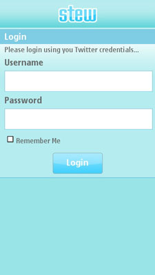
The Login view is used as an example of creating views within the HTML file. For more information about how to create the other STEW views, see the main.html example file.

Figure: STEW Login view
The Login view contains the following elements:
The first
divspecifies the title of the widget.The second
divis a formatting container for a table that contains all the elements through which the user interacts with the widget:An input element to enter the username.
An input element to enter the password.
A check box input element that allows the user to save their credentials on the device.
A link element that is styled as a button.
Using an HTML table as a container for all of the controls allows users to navigate from the top of the view down towards the end of the view. This navigation style works best on mobile device screens and is easiest for users. In addition, this navigation style enables adjusting the view dynamically on screens of different sizes.
<!-- ***** -->
<!-- LOGIN -->
<div id="login" class="hidden">
	<div class="top_bar">
		<div class="stew_title"></div>
	</div>

	<div class="login_container">
		<table cellspacing="0">
			<tr>
				<th>Login</th>
			</tr>
			<tr>
				<td>Please login using you Twitter credentials...</td>
			</tr>
			<tr>
				<td class="table_subtitle">Username</td>
			</tr>
			<tr>
				<td class="input_container">
					<input id="login_username" type="text">
				</td>
			</tr>
			<tr>
				<td class="table_subtitle">Password</td>
			</tr>
			<tr>
				<td class="input_container">
					<input id="login_password" type="password">
				</td>
			</tr>
			<tr>
				<td>
					<input id="login_remember_me" type="checkbox"><label for="login_remember_me">Remember Me</label>
				</td>
			</tr>
			<tr>
				<td class="button_container"><a id="login_button" href="#" class="button"></a></td>
			</tr>
		</table>
	</div>
</div> <!-- end of 'login' -->
Creating a button menu
The last div element in the HTML, menu_strip, defines an on screen menu that is displayed on devices with large screens.

Figure: STEW button menu
The menu consists of three div elements. Each div element specifies the background of a button that can have an activated state to indicate the currently active view. In this example, the activated style is added to the element which visually changes the background color of a button. For example, the Update button is active in the figure above. Within each div element, a link element specifies the button image and text. When the user presses a button, the associated view appears. The functionality to change the style and display a view is implemented by using JavaScript.
The link elements are used instead of using two background pictures in each div element to indicate the active status to support tactile feedback and localization. Only link elements support tactile feedback. It is easier to replace text than to regenerate the whole image for a language version.
For more information on how to create the functionality of the menu, see STEW: adding JavaScript to drive the widget logic.