Touch UI
When designing an S60 application, the UI must be designed so that everything can be done with touch. Therefore, the design must not rely on hardware keys (except for turning the power on and off).
The touch UI in S60 involves a number of specific touch components, component and UI behavior changes, layout changes and additions to the user experience. The main differences or additions include the following:
Resistive touch screen (HW)
Toolbar in touch UI (component)
For more information, see Toolbar.
Touch input (virtual keyboard, hand-writing recognition and virtual ITU-T) (components)
For more information, see Text input.
Stylus pop-up menu (component)
For more information, see Stylus pop-up menu.
On-screen dialer (an application)
Additional touch functionalities to some components (for example, Preview pop-up)
For more information, see Preview pop-up.
Touch-enabled common components
For more information, see Touch support for common S60 components.
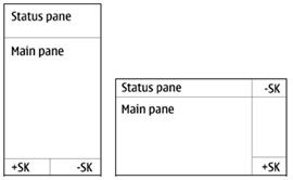
There are two generic layouts for touch UI: portrait orientation and landscape orientation, see the figure below. The Status pane in Touch UI has three variants: extended, flat and small.

Figure: Default S60 Touch UI layouts for portrait and landscape