Single selection
Actual radio button indicator does not exist for single selection; highlight on the entire item is shown instead. Single selection can be done with ChoiceGroup (POP-UP and EXCLUSIVE) and List. One of the choices is always selected; if 'no option' could be selected, add a choice with 'No option'.

ChoiceGroup type POP-UP

- Create with ChoiceGroup type POP-UP.
- Recommended component for single selection.
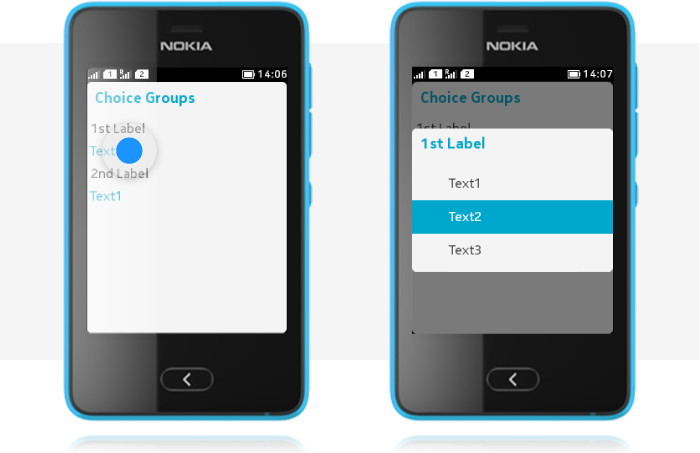
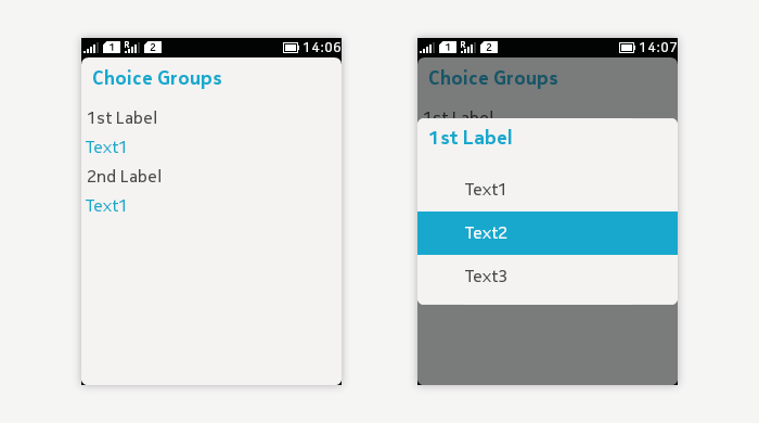
- Tapping on the parent item on Form opens a pop-up list of choices.
- Mandatory to always select one item from the predefined list.
- In case it is possible to have "no selection", add this as an item to the list.
- On Form:
- Only the parent item is shown.
- Title and currently selected value are visible.
- In selection pop-up:
- The choices are shown.
- Selected item has a highlight on the entire line.
- The pop-up closes when a selection is done.
- Cancelling is enabled with the Back key or by tapping outside the pop-up.
- Icons are optional and mirrored for right-to-left languages.
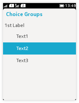
ChoiceGroup type EXCLUSIVE
 |
|
List.EXCLUSIVE

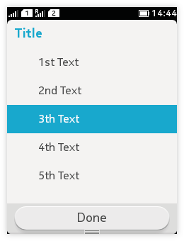
- Create with List.EXCLUSIVE.
- One list item is always selected.
- Optional icons appear on the left, and are mirrored for right-to-left languages.
- Selecting an item is done by tapping on the item.
- With a new selection, the previous selection is unselected.
- Short item titles are recommended.
- Text truncating and wrapping are supported.
- Command for confirming the selection should be added.
- Cancelling should be enabled with the Back key.