Buttons
Buttons are graphical components that have immediate reactive behavior. When tapped, pressed or selected, they show real-time feedback. Buttons can be used in different layout areas: Application content area and Dialogs. They consist of text label or graphic icon and are used only for initiating actions. Don't use buttons to set state, use Check box instead.
Touch-down event changes its appearance to the pressed state. Releasing the button performs the action and dragging off the button and releasing the press cancels the action. Buttons can be disabled based on the context of the application. Disabled buttons have a grey background and show the disabled state of the button rather than hiding it altogether. Segmented buttons are not supported.
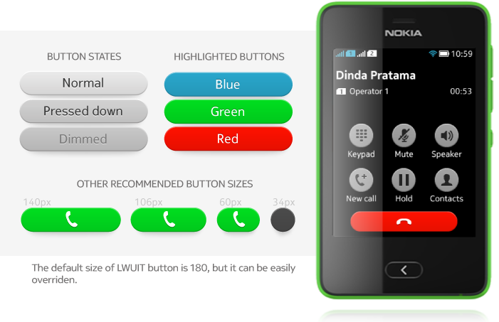
Textual Button
Content Area Textual Button
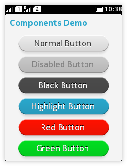
- Placed on canvas
- Takes the whole width of the canvas.
- Several textual buttons are presented on top of each other instead of side-by-side.
Graphical Button
Content Area Graphical Button
|
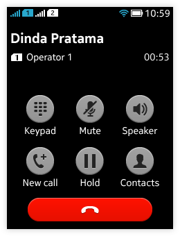 |
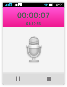 |
Toolbar area graphical button
|
Highlighted Buttons
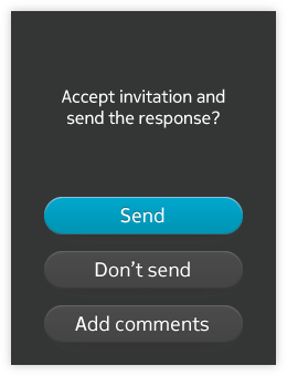 Highlighted buttons are optional and need to be styled by developer. Use highlighted button if you need to provide a button that performs a potentially destructive action, e.g. delete action will cause data loss and user may not be able to find the data back.
- Highlighted buttons can be blue, red or green.
- "Delete" button is highlighted in red when user is in delete mode.
- Use a highlighted button to indicate the default action in dialogs.
- To prevent loss of data or system access, select the safest and most secure command to be the default.
- If safety and security are not an issue, select the most likely or convenient command.
- E.g. "save" button on dialog is highlighted in blue as default, to indicate that 'save' is the suggested choice in the specific situation.
Below is a dialog with th default action button in the dialog and an example of deleting messages from the Inbox