Dialogs
Dialogs are temporary states that are used as part of the UI flow to prompt or inform the user about something related to what they are doing.
Can also be triggered outside the current flow and will be then displayed in the foreground, possibly interrupting the user's current flow. For example, a BT connection request dialog is shown on top of the current flow and the user is requested to either accept or reject the connection.
Dialogs are modal. User has to interact with the UI to dismiss the dialog, go back, or proceed with the flow.
Dialogs are not used for presenting scrollable information.
There are 3 types of dialogues:
- Prompting questions, information, or warnings to the user.
Spinner dialog
- Asking the user to wait while a process is ongoing.
Progress dialog
- Asking the user to wait and showing more detailed information about the ongoing process. Possibly giving more options regarding the process. Created using Form within the dialog (Dialog with Form).
Spinner and progress dialogs expire after the process is completed. While they are active, users cannot interact with the background state.
Dialog interactions
Dialogs have following behaviour by default.
| Gesture/key press | Behaviour |
|---|---|
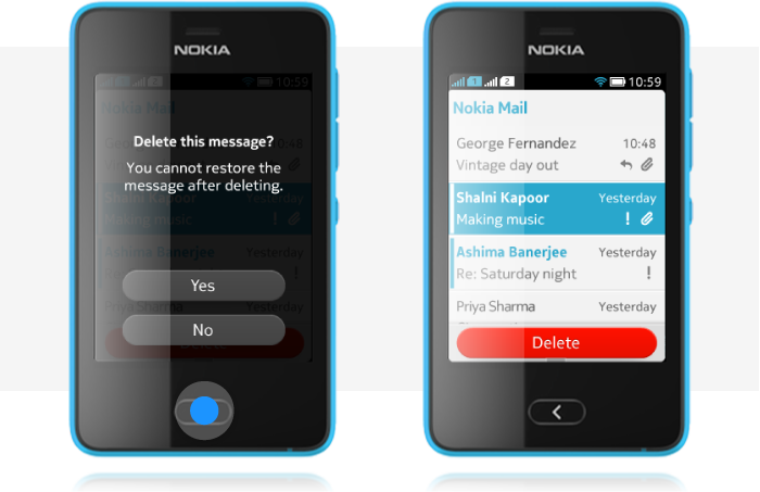
| Back key , short press | Dismisses the dialog and goes to the previous state. If dialog has a negative response button, back key functionality should be mapped to work in the same way. |
| Back key, long press | Dismisses the dialog, performs the negative action (like short press of back key) and exits the application or flow to home screen. |
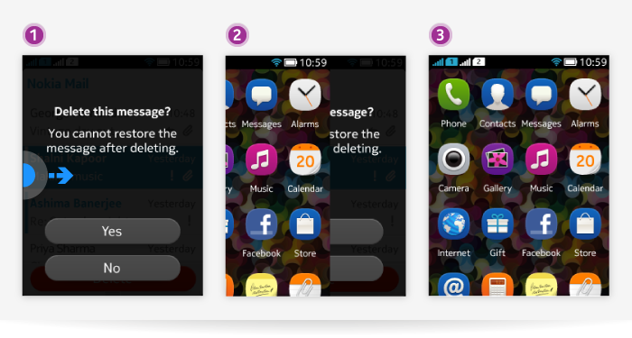
| Side swipes | Exits the application or flow and goes to home screen. Thus, dismisses the dialog with the application exit. |
| Top and bottom swipes | Disabled. No access to notification panel while dialog is displayed. Dialog never contains option menu. |
| Tapping a button inside the dialog | Dismisses the dialog and either goes to previous state or proceeds with the flow with chosen action. |
| Tapping another element inside the dialog, e.g. check box | Toggles the check box marked and unmarked. |
Below is an example of pressing Back key in a dialog.
Below is an example of a dialog and corresponding UI flow which can be exited with side swiping. Top and botton swipes are inactive.
When UI displays a banner, it is shown on top of the dialog. Top and bottom swipes are inactive when a dialog is displayed.
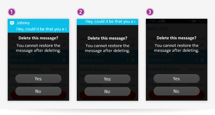
Confirmation dialog
Main purpose is to ask users to confirm an action.
- Giving important information to the user.
- Warning the user about possibly hazardous actions that they are about to take.
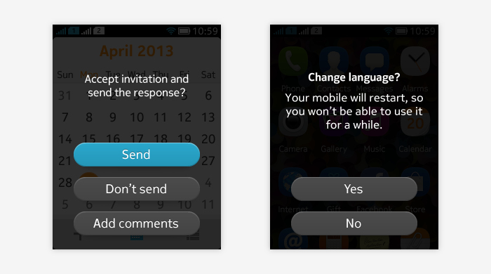
Confirmation dialog can contain the following elements (different combinations are possible based on the needs of the use cases):
Text
- Always mandatory.
- Should be concise to make it easy to grasp the meaning.
- Should not be scrollable. If text is too long and needs scrolling support, consider using custom states instead of dialogs.
Title text
- Possible to add title text as a header for the dialog when it adds information that needs to stand out from other text.
- Using title text should be avoided if it only repeats the information that can be described with the actual dialog (for example, the title is not needed if the title would be "import all" and the text part would be "do you want to import all contacts?")
Buttons
- At least 1 button is always mandatory.
- Max 3 buttons can be used.
- Buttons are always placed on top of each other and shown at the bottom of the dialog.
- One of the buttons can be highlighted.
- Typical for confirmation dialogs: one button confirms the action, the other button declines the action.
- Can also be used for confirming or skipping an action when presented as part of a continuous flow.
Check box
- Can be added if there is a need to give users control for a setting, e.g. auto-connecting with a BT device that asks for pairing.
- Is typically displayed above the button(s).
- On/off settings can be presented as check boxes in temporary dialog states.
Graphics
- Branded graphics can be used (e.g. icons for specific brands).
- Generic icons like information, warning, error etc. should not be used.
- No need to add e.g. thumbnails of contact or image to be deleted. User should know what he is deleting from previous state and by seeing name of the contact in the dialog.
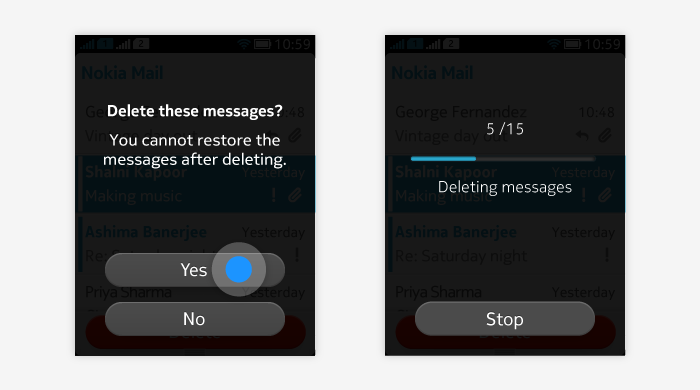
Below are few examples of confirmation dialogs.
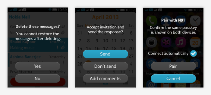
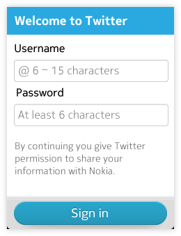
Do not use confirmation dialogs to make users read legal issues or statements that they need to agree to before continuing. Use UI state with body text and necessary button(s) on content area instead.
Progress dialog
Used when the UI is halt for ongoing process and the progress can be illustrated to the user by using a progress bar.
Progress dialog elements:
Text
- Mandatory, informs users about what process is ongoing.
- Whenever possible, it should also give more information about the progress, e.g. showing the count of items already processed and how many are in total to be processed.
Title
- Can be used if it adds extra value on making the dialog more understandable for the user.
- Should be used if there is something that needs to stand out and noticed as first thing about the dialog.
- Should not be used to state the obvious (for example, do not show app name if the user is already inside the app) or to repeat information that is or can be easily and clearly included in the text section.
- Mandatory.
- Progress bar cannot be used directly in LWUIT Dialogs. Add a Form to the Dialog, and then use Progress bar inside the Form.
- Optional.
- Typically one button is used to enable users to stop/cancel the process.
Below are the examples of progress dialogs.
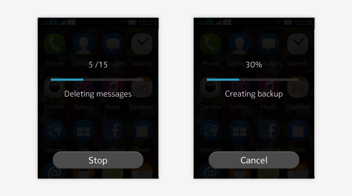
Guidelines
Avoid using many dialogs in sequence, especially if dialogs would be of the same type. Sequential dialogs give feeling of not being in control when system presents user a question after another. Dialogs can be presented in sequence if they form a logical flow.
Below is an example of presenting dialogs in sequence.
