Switches
Used to quickly switch from one value to another. User can see and interact with the values of a switch directly without opening another layer that displays the values (compare to Choice picker). Typically used for setting items.
Have mandatory label that is used as a title for the item; tapping on the label part of the switch does not have any interaction.
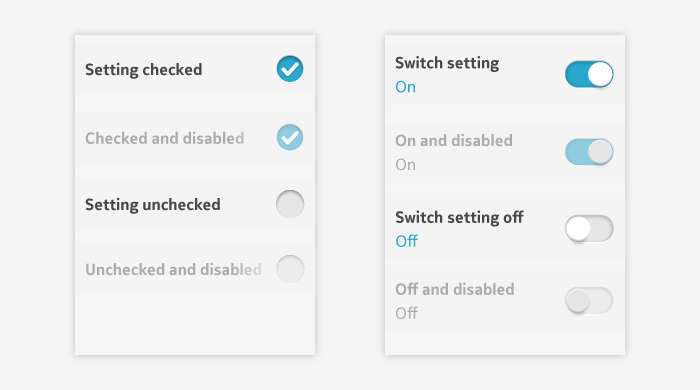
Can be disabled. When disabled and inactive, the check box still displays the selected value that would be selected if switch becomes active again.
- Switch (on/off switch).
- Check box.

- Application design can use either switch or check box control types for on/off settings or selections.
- The most common is switch.
- If switch button has too heavy mental model for the setting in question, use check box.
- For example, check box usage is more suitable when presenting an on/off choice as part of a dialog or configuration.
Switch
 Designed to look like a small on/off switch:
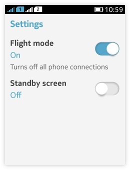
- Has label text, setting value text, and button.
- The value texts are typically "On" or "Off", but other texts can be used as value texts when they better describe the selected value.
- Tapping a switch button toggles the setting on or off.
- The button appearance and setting value text change when the switch is tapped.
- For settings where you specifically wish to reinforce the mental model of an on/off switch to the users.
- Only use the switch component if the two states are clearly understandable and unambiguous opposites.
- The pair of values should be predictable so that users do not have to slide the control to discover what the other value is.
- If not, use Choice picker so that you can label each choice independently.
- Can be used in a setting list to be a main control for a certain group of settings.
- Depending on the choices users make, new items might appear or disappear, or might become active or inactive.
Check box
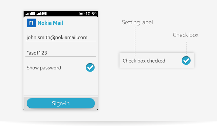
- Layout contains setting label and check box graphic.
- One tap on the check box graphic toggles the selection between on and off.
- The check box is empty when the setting value is off and it is marked with a tick when the setting value is on.
Use check box when there is an individual boolean choice. Suitable when presenting on/off choice as part of a dialog or configuration. Do not to present multiselections by using several check boxes together. For multiselection, use multichoice picker or multiselection mode (see Pickers and Handling multiple items).

Using a single action button as a toggle
A single button can be used to toggle between two values in cases where screen space is limited and the values are truly opposites. An example would be the shuffle command in a media player or toggle between camera and video recorder in camera view finder. The selected value is indicated by the button graphic which changes when button is pressed. A toggle button can be also disabled. For more information about the buttons, see Buttons.