Progress indication
Two kinds of progress indicators are available:
- Progress bar (Slider).
- Spinner.
For each process, always use only one progress indicator at a time.

Use progress indicator if there is something in the view the user has to wait for:
- Will the operation complete in about five seconds or less? If so, use a spinner instead of a progress bar, because displaying a progress bar for such a short duration would be distracting.
- Is an indeterminate progress bar combined with an animation? If so, use just the animation instead. The indeterminate progress bar is effectively a generic animation and adds no value to the animation.
- Do you know the duration and want to show the status of the ongoing activity? Use a determinate progress bar.
- When the duration is not known, use a Spinner.
- Size the progress indicator appropriately in relation to other UI components.
Progress bar (Slider)
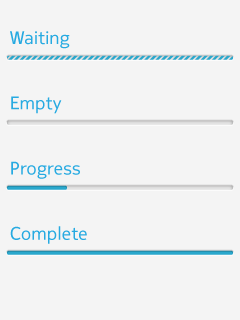
Determinate progress bar
 |
|
Indeterminate progress bar
|
 |
Recommendation: usage of Spinner is preferred over indeterminate progress bar.
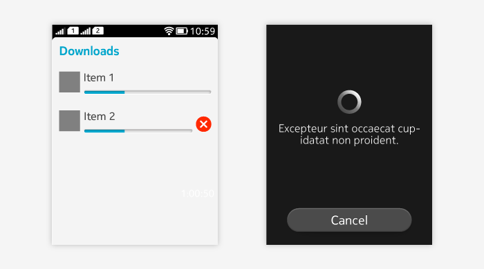
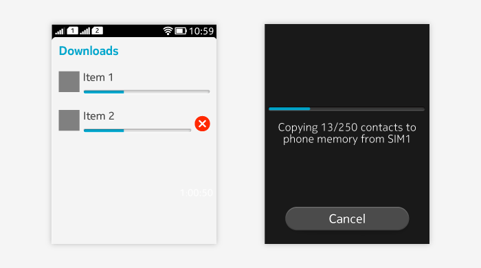
Progress bar in list item and in dialog
List item can have a progress bar, to show a list of progress items.
- If the progress list item is used for downloading or updating, a cancel button can be placed next to the progress bar.
- Tapping cancel button dismisses the ongoing download.
Progress bar can be used in dialogs if the ongoing activity can be paused or cancelled.

Spinner
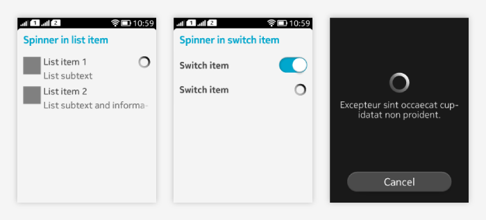
Spinner indicates actions such as scanning, refreshing, and loading with unknown or known duration. Spinner is non-interactive.
Usage:
- Can be shown in:
- List items.
- Switch.
- Spinner dialog.
- Refreshing bar.
- Group headers.
- If only a single existing item is currently updated in the UI, spinner is shown next to/inside it.
- For example, a drill down list item shows a spinner when opening the next view takes time.
- If the whole view is updating, consider using the spinner in the same way as for the Refreshing pattern.
- Select the size of the progress indicator depending on the size of the other UI components visible at the same time.
- If the whole view is empty, use the largest spinner, for example.
- If you only have one list item updating, consider using the smallest spinner instead.
