High-level APIs porting
High-level components enable portability across devices by employing a high level of abstraction and provide a pre-defined look and feel. For more information, see High-level UI components.
The following high-level user interface components work satisfactorily in full touch without any change:
-
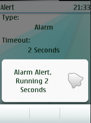
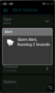
Alert - A popup screen to notify the user about an event.
-
Form - A screen to which Form Items can be added. The Items are also considered high-level APIs.
-
List - A screen containing a scrollable list of choices.
-
TextBox - A screen in which the user can enter or edit text.
However the following needs porting:
-
Command mapping and handling: The way the commands are mapped and handled in full touch UI is different so this must be taken care in the MIDlets.
-
Adding orientation support: For a better user experience in the full touch device, you can add orientation support.
-
Adding CategoryBar: For switching between different views within the same MIDlet, you can add CategoryBar
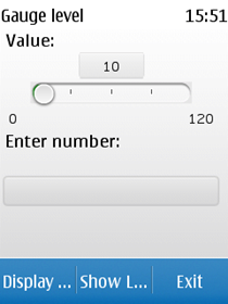
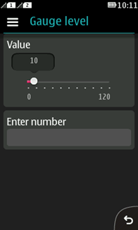
The following images show the SimpleTest MIDlet running on touch and type and full touch without any change in the code.
|
In touch and type |
In full touch |
|
|
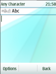
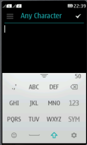
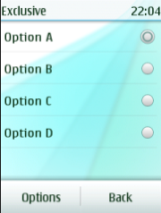
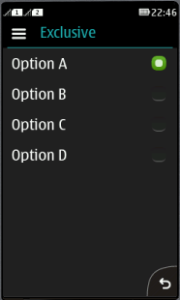
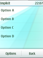
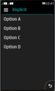
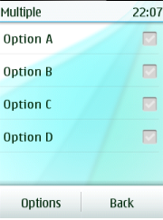
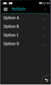
The following table shows the high-level UI components on the touch and type, and full touch platforms.
|
UI component |
Touch and type |
Full touch |
|
Alert |
|
|
|
TextBox |
|
|
|
List- Exclusive |
|
|
|
List – Implicit |
|
|
|
List – Multiple |
|
|
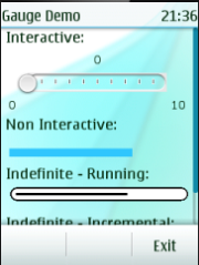
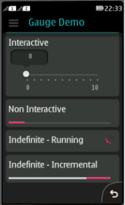
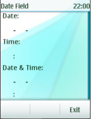
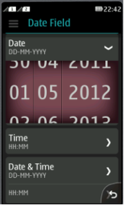
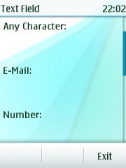
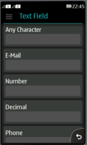
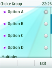
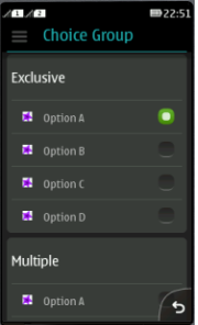
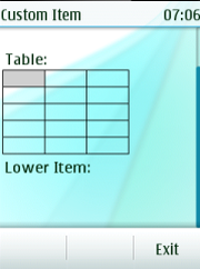
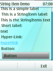
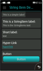
The following table shows the items (DateField, ChoiceGroup, TextField, Gauge, StringItem, and CustomItem) on the touch and type, and full touch platforms.
|
Item |
Touch and type |
Full touch |
|
Gauge |
|
|
|
DateField |
|
|
|
TextField |
|
|
|
ChoiceGroup |
|
|
|
CustomItem |
|

|
|
StringItem |
|
|