Selecting the right UI library
When you are designing your application, you can select from high level UI components or low level UI components (canvas).
High-level UI elements use the native touch implementation provided by the device, so you do not need to separately program touch interaction for them. Low-level UI elements, however, do not automatically implement touch functionality, so you need to separately listen for and handle touch events for these elements.
High-level UI components
LCDUI is a solid UI framework familiar to most Java ME developers. It provides a compact selection of basic high-level UI components that provide a pre-defined look and feel of the Series 40 and Asha software platform 1.0. You can use components of the Nokia UI API together with the LCDUI components. High-level UI is a good choice when platform look and feel is crucial and the easiness of the development and robustness of the UI is more important than impressive effects or application branding. When you are using high-level components, the platform takes care of drawing, fonts, and keypad and touch handling when scrolling and selecting items. Because of this, high-level UI components are highly portable.

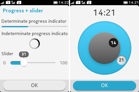
Figure: High-level UI components
The high-level APIs are:
-
Form (with ChoiceGroup, DateField, TextField, StringItem, ImageItem, Gauge, Spacer, CustomItem)
The selection of LCDUI components is pretty limited and they are generally not customisable. In order to provide custom elements on an otherwise high-level user interface, you can have a CustomItem on Form. Or they can have applications with separate high-level and low-level views. Examples of typical applications with high-level UI components are productivity applications (converters, calculators, to-do lists) and applications relying on a form-based structure (flight/hotel search guides). Also custom applications may utilise high-level components in their settings view.
Low-level UI components (canvas)
LCDUI also contains Canvas, a low-level API that gives you an experience to control graphic elements and customise features. When you use low-level components, you are responsible for supporting different input mechanisms and scaling the UI on different screen resolutions and orientations to make the application portable. Creation of custom UIs is considered more time consuming and difficult than high-level UI components.

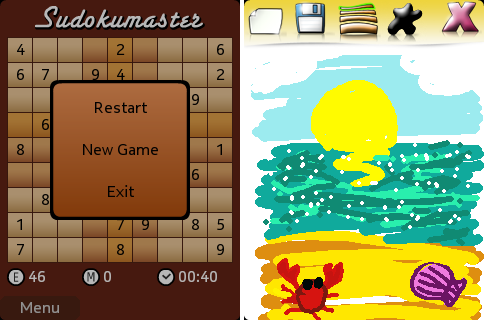
Figure: Low-level UI components (canvas)
The low-level APIs are:
Examples of typical applications with low-level UI are games, multimedia applications, and branded applications.
LWUIT components
When using LWUIT, you can utilise a wide selection UI components, layouts, and effects. LWUIT UI components can be considered high-level components as they support both touch and non-touch use and scale to different resolutions and orientations. Because of these reasons, LWUIT is also highly portable. LWUIT supports localisation including right-to-left languages. In LWUIT for Series 40 and Asha software platform 1.0, default themes for each platform’s UI styles are provided but you can also create custom themes for branded look and feel. LWUIT also allows customising the UI components style and functionality. you can even create your own components either by deriving from any of the existing components or creating them from scratch.

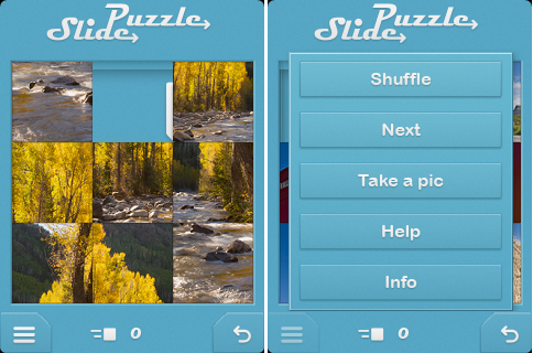
Figure: LWUIT components
Examples of LWUIT components are:
-
Form
-
List
-
Dialog
-
Label
-
Button
-
RadioButton
-
CheckBox
-
ComboBox
-
Slider
-
Spinner
-
TextArea
-
TextField
In addition, there are a number of components of the Nokia UI API and other Series 40 and Asha software platform features available in the Nokia branded LWUIT library.
Though LWUIT is optimised for Series 40 and Asha software platform 1.0, LCDUI is a better option for performance critical applications especially on phones with cost-optimised hardware. Also, when a compact application binary size is crucial LCDUI is considered instead because the LWUIT library is added to every LWUIT application, which adds application size by 200-800KB (depending on the application features). LWUIT is supported from Series 40 6th Edition devices onwards with QVGA or larger screen.
LWUIT is provided as a plugin in the Nokia 2.0 SDK for Java and in the Nokia Asha SDK 1.0. LWUIT user interfaces are usually created in the code editor in the IDE in the same fashion as LCDUI. LWUIT provides an additional tool Resource Editor, that can be used for creation of custom themes and localisation. It also provides a GUI Builder that enables creation of application UIs, which is useful in quick prototyping.
Concerning the easiness of coding, the coding syntax in LWUIT is similar to UI high-level components so the learning curve is short for developers familiar with Java ME. Compared to low-level canvas, LWUIT is much easier to develop with because many things are built-in (for example, scalability and orientations, touch and keypad support).
Compared to low-level canvas, you can also achieve a fair reduction in application code size (excluding the LWUIT library size). Compared to high-high-level UI, there is no big difference in similar type of applications. Examples of typical LWUIT applications are branded applications and productivity applications.