|
|
Summary:
-
Dialog is used for:
-
Appears on top of the application content area, centered on screen.
-
0, 1, and 2 button dialogs are directly supported.
-
Custom solutions required for:
-
Can listen to threads; those must be started before the dialog
is displayed.
-
Platform specific features:
|
LWUIT
Related design guidelines
|
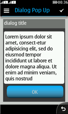
Note:
It is not recommended to use Dialog
in the pop-up dialog mode, since it
is not part of the Series 40 UI style in any of the three platform
releases (non-touch, touch and type or full touch).
Basics

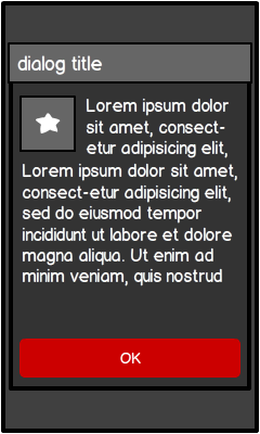
Figure: Dialog with title, icon and 1 button
|
-
Interaction:
-
Dialogs are typically dismissed by pressing a dedicated button,
for example:
-
'OK', when alert is purely informative.
-
'Cancel', when there is an ongoing operation.
-
Buttons can be used for short commands only (for example: Yes,
No, Cancel, Back, etc.)
-
Title is recommended; if title is not defined, the title zone
is shown but is empty.
-
In case the text is dynamic, split it up into title and body;
for example:
-
Body text is limited and cannot be scrolled by default.
-
If long body text is necessary, open a new text view instead.
-
New view might require additional buttons like "OK" and "Cancel",
icons might not be sufficient (i.e., Back arrow and checkmark in action
button 1).
-
Fully supported:
-
0 buttons, timed dialog.
-
1 button.
-
2 buttons.
-
Custom solutions:
-
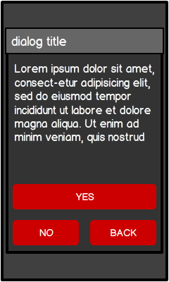
3 buttons.
-
Additional icon.
-
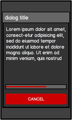
Determinate progress indicator (modified slider).
-
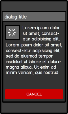
Indeterminate progress indicator (busy indicator, UI component
itself requires a custom solution).
-
Structure:
|
Supported
formats

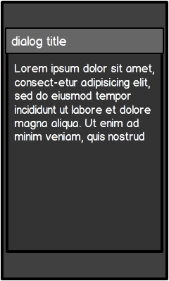
Figure: Timed dialog
|

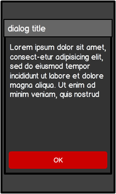
Figure: 1 button dialog (default dialog)
|

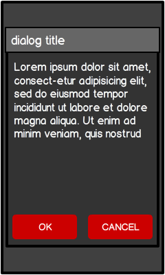
Figure: 2 button dialog
|
|
-
The UI style is based on dialogs with up to 3 buttons.
-
In LWUIT, only up to 2 buttons directly supported.
-
If 0 buttons are used:
-
If 1 button is used (confirmation):
-
This is the default dialog.
-
Stays on the screen until user taps the button.
-
Ensures that user has had time to read the text because:
-
If 2 buttons are used (confirmation query):
|
Custom
formats
LWUIT does not directly support all use cases which
are necessary to fully support the Series 40 UI style. The following
use cases require custom solutions.

Figure: 3 button dialog
|

Figure: Icon in dialog
|
|

Figure: Progress indicator
in dialog
|

Figure: Busy indicator in dialog
|
|
Platform
specific features
|
Full touch
|
Touch and type
|
Non-touch
|
Description
|

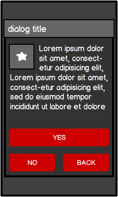
Figure: Dialog with icon and 3 buttons in full touch (custom solution)
|

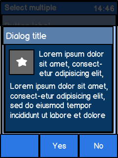
Figure: Dialog with icon and 3 buttons as softkeys in touch and type
(custom solution)
|

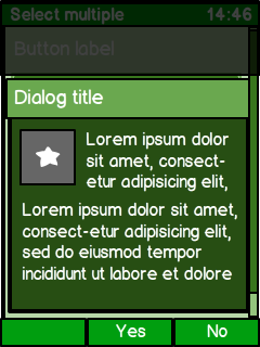
Figure: Dialog with icon and 3 buttons as softkeys in non-touch (custom
solution)
|
-
Full touch:
-
Buttons are part of the dialog area.
-
3rd button (main action) is placed on top of other 2 buttons.
-
Button labels are all caps.
-
Dialog is centered.
-
Icon is top-left aligned.
-
Touch and type:
-
Only 2 buttons possible.
-
Buttons are in the softkey area.
-
Yes/OK
(positive command) is in the MSK.
-
No/Cancel (negative command) is in the RSK.
-
Button labels are initial caps.
-
Dialog is bottom aligned.
-
Icon is top-left
aligned.
-
Non-touch:
-
Only 2 buttons possible.
-
Buttons are in the softkey area.
-
Yes/OK (positive command) is in the MSK.
-
No/Cancel (negative command) is in the RSK.
-
Button labels are initial caps.
-
Dialog is bottom aligned.
-
Icon is top-left
aligned.
|
