List picker (ComboBox) and PopupChoiceGroup
Summary:

  • This component is subject to changes.

  • Picker button:

    • Shows the current value.

    • Opens a list.

  • List is on top of the parent view.

  • Recommended alternative in full touch is the PopupChoiceGroup.

LWUIT

Related UI guidelines

Note:

Current value is the ComboBox value before the list is opened.

Basics
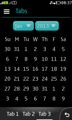
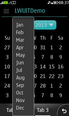
Figure: List picker button (Jan, 2013)

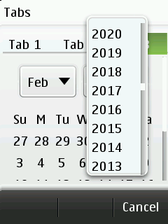
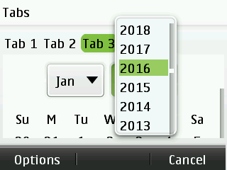
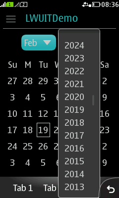
Figure: List picker list open

  • Interaction:

    • ComboBox button:

      • Shows the current value.

      • Opens a list by pressing it.

      • Optional label next to the button.

      • Button dimensions must be large enough to show each list item.

      • Only single line text in the button.

    • ComboBox list:

      • Opens on top of the parent view.

      • Parent view is not dimmed.

      • Items should be single line.

      • Allows all the rendering features of the List component.

      • Current implementation uses too small touch areas. Touch areas should be 7mm x 7mm minimum.

    • The list should not hide the button.

      • No highlight in the list, current value is not indicated in the list.

      • Button shows the current value.

  • Structure:

    • ComboBox is a subclass of List.

Formats

ComboBox style

Figure: ComboBox style

  • Standard component offered by LWUIT.

  • Will be either restyled or replaced.

  • Default implementation:

    • Has too small touch ares.

    • List may hide the current value.

    • Parent view is not dimmed.

  • Current style is not recommended for any implementation.

    • Current value is not visible in case the list open.

    • Touch areas are too small.

Popup ChoiceGroup style (full touch)

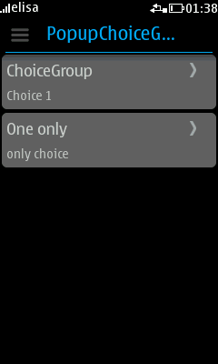
Figure: ChoiceGroup style, closed

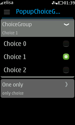
Figure: ChoiceGroup style, opened

  • Recommended replacement for standard ComboBox.

  • Look-and-feel close to platform UI component behaviour.

  • Button is a two row item:

    • 1st line shows the title.

    • 2nd line shows the value.

  • Pressing the button opens and closes an exclusive choice list with max 3,5 items visible at once.

Formats and platform specific features

Full touch

Touch and type

Non-touch

Descriptions

Figure: View in full touch

Figure: View in touch and type

Figure: View in non-touch

  • Full touch:

    • Tapping outside the list dismisses the list and keeps the current value.

  • Touch and type:

    • Tapping outside the list dismisses the list and keeps the current value.

  • Non-touch:

    • Requires focus on ComboBox to open.

    • MSK is empty.

    • RSK "Cancel", keeps current item, closes the list.

    • LSK "Options" opens the Options menu which contains "Select".

    • List highlight is for focus, does not indicate the current value.

    However, currently style ComboBox component is not recommended for use with non-touch.