|
|
Summary:
-
List is a combinations of text, thumbnails and controls.
-
Controls can be:
-
Check box, or
-
radio button.
-
A list item can have multiple rows and multiple columns.
-
Automatically becomes scrollable if it contains more list items
that can be fitted to the view.
-
Lists can be build from
various Form components (for example, RadioButton, CheckBox, or TextArea).
|
LWUIT
Related design guidelines
|
Basics

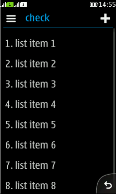
Figure: Explicit choice list with "add" as primary action
|

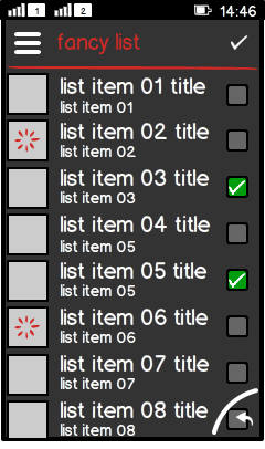
Figure: Fancy list (custom solution)
|
-
Lists are used for:
-
Presenting content items in list views.
-
Enabling drill down navigation.
-
Invoking actions, for example opening another app.
-
Standard list item layouts:
-
One or multiple rows.
-
Optional icon.
-
Optional thumbnails.
-
Optional controls..
-
Lists may be divided into sections with group headings; use group
headings to index larger data sets (for example, different news categories
on a "news" main page).
-
List item elements:
-
Primary text:
-
Subtext:
-
Additional information of the item , e.g. duration or price.
-
Discription of the primary text.
-
Timestamp.
-
Shows duration, price, or size for the item.
-
Thumbnail:
-
Left aligned, for left-to-right languages.
-
Can also include informative icon instead of thumbnail image.
-
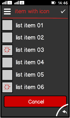
Can show a spinner.
-
Progress bar:
-
Interaction:
-
Structure:
|
Formats
Simple list (implicit choice), single line, truncated, wrapped

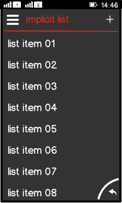
Figure: List with single line items
|

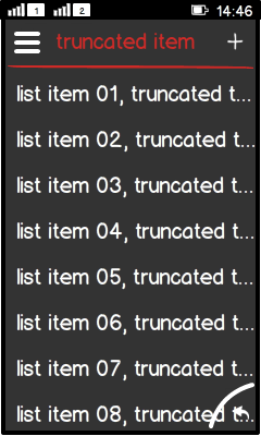
Figure: List with truncated single line items
|

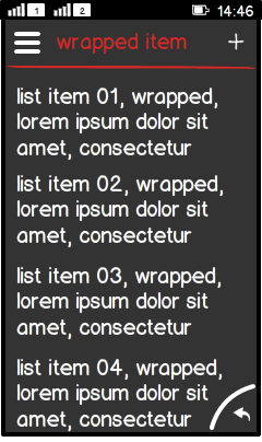
Figure: List with wrapped single line items
|
-
Single line:
-
Truncated:
-
One or multiple items are too long for a single line.
-
Text is truncated and truncation is indicated by "...".
-
Requires drill down view which shows the entire text.
-
Wrapped:
|
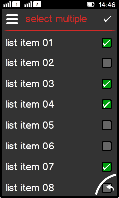
List with controls;
radion button, check box

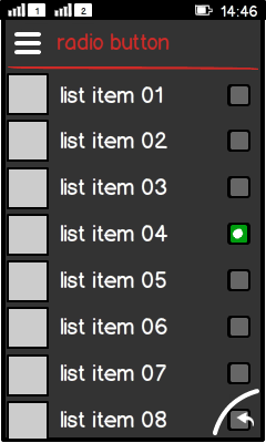
Figure: List with radio buttons
|

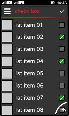
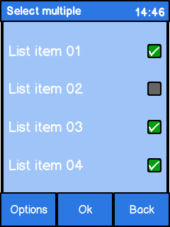
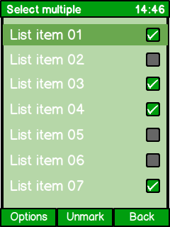
Figure: List with check boxes
|
-
Radio button (group):
-
Check box (list):
|
Custom solutions: fancy
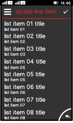
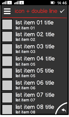
list; list with icon, list with 2 line items and list with 2 line
items and icon

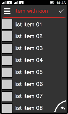
Figure: Fancy list with icon (custom solution)
|

Figure: Fancy list with 2 line items (custom solution)
|

Figure: Fancy list with 2 line items and icon
|
|
Custom solution: List
with download indicator

Figure: List with download indicator
|
-
Download indicator is progress bar or spinner.
-
Use determinate progress indicator, if possible.
-
Progress bar is shown under the item.
-
Spinner is:
-
Must contain a button to terminate the ongoing process:
-
Textual button recommended.
-
"Cancel"; stop and delete everything done so far.
-
"Quit"; stop and keep everything done so far.
|
Platform
specific features
|
Full touch
|
Touch and type
|
Non-touch
|
Descriptions
|

Figure: View in full touch
|

Figure: View in touch and type
|

Figure: View in non-touch
|
-
Full touch:
-
Touch and type:
-
Non-touch:
-
MSK:
-
Select (implicit choice, exclusive choice), or
-
Mark/Unmark (select multiple).
|
