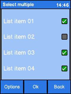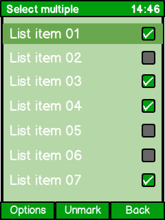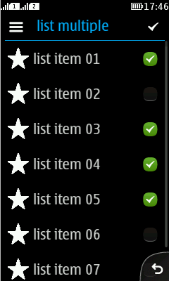
Check box

Summary:

  • Zero, one, or more items can be selected at the same time.

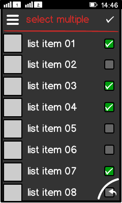
  • Selected items have a tick mark.

  • If only one item, used as switch-like UI component.

  • Requires an acknowledge button, e.g. "Done", to indicate the end of the selection process.

  • Options menu should contain Mark all/Unmark all.

  • Basics for touch:

    • Show touch down feedback.

    • Trigger on touch release.

  • Basics for non-touch:

    • Requires focus.

    • Middle softkey should be "Mark/Unmark".

    • Triggers on key down.

LWUIT

Related design guidelines

Basics

Figure: Check boxes in portrait view

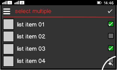
Figure: Check boxes in landscape view

Interaction

  • Pressing the list item, the place holder or check mark toggles between:

    • Off-state (place holder), default state.

    • On-state (chek mark).

  • Select zero, one, or multiple values from a predefined list.

  • Check box group may contain:

    • Only one item (switch-like UI component).

    • Multiple items (multi-selection).

  • Requires a confirmation action (for example, via action button 1).

  • If changes were made:

    • Acknowledge is done with action button 1.

    • Cancel is done via back button.

    • Back requires an additional confirmation dialog:

      • Do you want save changes?

      • Yes/No/Back

  • If no changes were made:

    • Action button 1 returns to previous view, no dialog.

    • Back returns to previous view, no dialog.

  • Selected items have a tick mark.

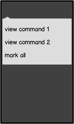
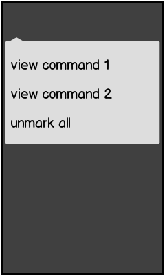
  • Options menu should contain "Mark all/Unmark all".

  • Settings views keep the last state.

  • Opening a selection list the first time sets all check boxes to off-state.

Figure: Options menu with "mark all"

Figure: Options menu with "unmark all"

Check boxes can appear in:

  • List.

  • Form.

  • Dialog with Form.

  • Recommended to use a list with check boxes in a separate view.

  • If mixed with other lists (for example, in a settings view), you must use labels to separate the lists.

Touch screen phones:

  • Show touch down feedback.

  • Trigger on touch release.

Non-touch phones:

  • Requires focus.

  • Middle softkey should be "Mark/Unmark".

  • Triggers on key down.

Structure:

  • Check box is a subclass of Button.

  • Button is a subclass of Label.

Formats

List and Grid

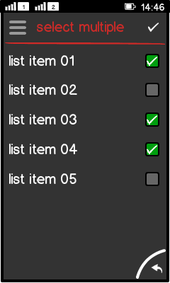
Figure: Multi selection list

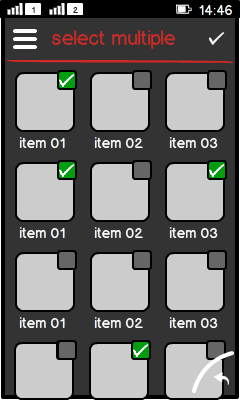
Figure: Multi selection grid

  • Based on Form.

  • Select:

    • None,

    • one, or

    • multiple items.

  • Arranged as list:

    • Check box text is left aligned.

    • Check box icon and place holder are right aligned.

  • Arranged as grid:

    • Check box is placed top right in each item.

Check box groups

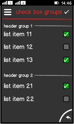
Figure: Check box groups with a separator

  • Group may contain one or multiple items.

  • Groups are separated by group header to indicate:

    • The relationship between different items.

    • Where the next group start.

  • Header is done with label.

Check box in a form or dialog

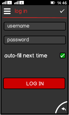
Figure: Check box in a log-in form

  • Can be embedded directly into a Dialog.

  • Used:

    • As a switch-like UI component.

    • If the values are truely opposite (On/Off or Yes/No).

Platform specific features

Full touch

Touch and type

Non-touch

Special features

Figure: View in full touch

Figure: View in touch and type

Figure: View in non-touch

  • Event trigger:

    • Touch triggers on touch release.

    • Non-touch triggers on key down.

  • Non-touch requires :

    • A focus on the item to check/uncheck it.

    • "Mark/Unmark"command as middle soft key.

    • Can show more items in a view than touch and type, since no touch area is limiting the minimum item height.

  • Full touch uses different typography rules:

    • List item is all lower case.