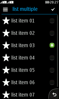
Radio button

Summary:

  • Always one item is selected.

  • Only one item is selected at a time.

  • Selected item is indicated by a filled radion button.

  • Requires at least 2 items for the radio button group.

  • If only one radio button group is in the view, the view may close automatically after selecting one item.

  • If there are multiple radio button groups in the view, use headers — for example, group headers — to separate the radio button groups.

  • Basics for touch:

    • Show touch down feedback.

    • Trigger on touch release.

  • Basics for non-touch:

    • Requires focus.

    • Middle softkey should be "Select".

    • Triggers on key down.

LWUIT

Related design guidelines

Basics

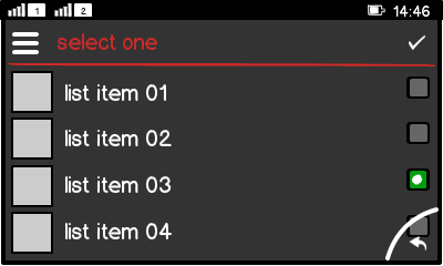
Figure: Radio button group in landscape view

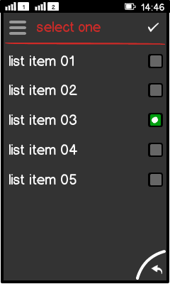
Figure: Radio button group in portrait view

Interaction:

  • Select one value from a predefined list.

  • Mandatory to select one item.

  • Requires at least 2 items.

  • In case it is possible to have "no selection", add this as an item to the list.

  • Two basic flows are possible:

    • Auto confirm:

      • Select an item.

      • Automatically submit the new value, and close the view.

    • Manual confirm:

      • Selecting an item changes only the highlight to the new item.

      • Change has to be confirmed, e.g. via "done" found from:

        • Action button 1 (full touch).

        • Middle soft key (touch and type).

        • Options menu (non-touch).

  • Use the radio button as an indicator.

  • Do not use the checkbox icon as an indicator for exclusive selection.

Radio buttons can appear in:

  • List.

  • Form.

  • Dialog with Form.

Touch screen phones:

  • Show touch down feedback.

  • Trigger on touch release.

Non-touch phones:

  • Requires focus.

  • Middle softkey should be "Select".

  • Triggers on key down.

Structure:

  • Radio button is a subclass of Button.

  • Button is a subclass of Label.

  • Requires ButtonGroup component to highlight/unhighlight the radio button group items.

  • By default, the ButtonGroup component sets all items to off.

  • Define one ButtonGroup item to be "on" by default to make the radio button group work correctly.

  • Radio button text is left aligned.

  • Radio button icon is right aligned.

Formats

List

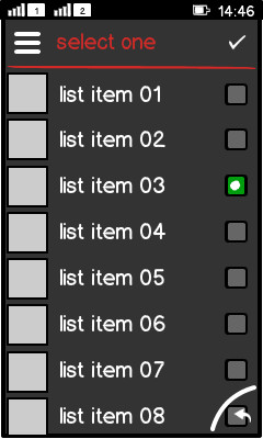
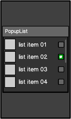
Figure: Radio button list

  • Based on Form.

  • One item in the list is always selected.

Radio button groups

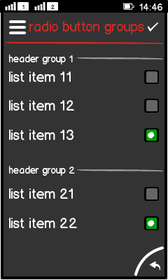
Figure: Two radio button groups with a separator

  • One item of each group is always selected.

  • Groups are separated by a group header to indicate:

    • There are more groups.

    • Where the next group starts.

    • Why there is always one selection per group.

  • If 2 or more radio button groups are in a view:

    • Do not close the view automatically after selecting an item.

    • There must be a way to acknowldge the changes being made, e.g. check mark in action button 1.

Radio button group in a dialog

Figure: Radio button group in a dialog

  • Can be embedded directly into a Dialog.

  • Used if:

    • There is an ultimate requirement to set a certain value.

    • The values are non-opposite values (e.g. red – orange).

Platform specific features

Full touch

Touch and type

Non-touch

Special features

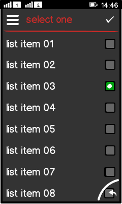
Figure: View in full touch

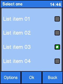
Figure: View in touch and type

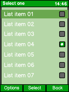
Figure: View in non-touch

  • Event trigger:

    • Touch triggers on touch release.

    • Non-touch triggers on key press.

  • Non-touch requires:

    • A focus on the item to set the highlight.

    • "Select" command as the middle soft key.

    • Can show more items in a view than touch and type, since no touch area is limiting the minimum item height.

  • Full touch uses different typography rules:

    • List item is all lower case.