UI components
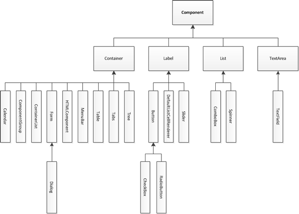
All the UI components (widgets) derive from the Component class. The figure below shows the widget class hierarchy.

Figure: Component class hierarchy
Component
A Component is an object having a graphical representation that can be displayed on the screen and can interact with the user. The buttons, check boxes, and radio buttons in a typical graphical UI are all examples of a component. Component is the base class. All the widgets in the Lightweight UI Toolkit library use the composite pattern in a manner similar to the AWT Container and Component relationship.
Container
A Container is a composite pattern with a Component object. It enables nesting and arranging multiple components using a pluggable layout manager architecture. Containers can be nested one within the other to form elaborate UIs. Components added to a container are tracked in a list. The order of the list defines the components' front-to-back stacking order within the container. If you do not specify an index when you add a component to a container, it is added to the end of the list (and hence to the bottom of the stacking order).
UI components: