Forms
The LWUIT Form can be used for various types of application views, and its usage is by no means restricted to collecting user input. However, the Form component supports this kind of task very well. All Form elements should appear one after another in the view, and the view automatically becomes scrollable if the content does not fit the screen.
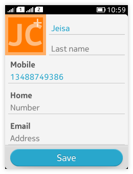
All LWUIT elements can be added on a Form: Button, Calendar, Category bar, Check box, ComboBox, ComponentGroup, DatePicker, Label, Slider, Spinner, Tabs , TextField, TextArea, Table, TimePicker, Tree, UnitPicker.
There can be 1 command at the bottom of the screen. The rest of the Commands are in the Options menu.
The Form must offer a way to confirm the changes made: either through the Options menu or a suitable Command at the bottom of the screen (e.g. "Done" or "Save").
Pressing the Back key within a form cancels all changes done. No confirmation dialog should be displayed when the back key is pressed. By pressing the back key, users should go back to the state where they opened the form.
Button
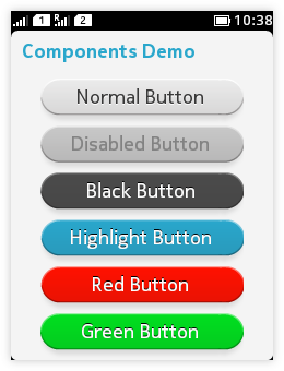 |
See Buttons for more information. |
Calendar
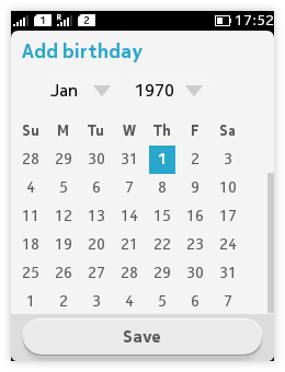 |
Note: Calendar is LWUIT's own component. In order to be aligned with the platform's look-and-feel, it is recommended to use the DatePicker for selecting dates, see Pickers for more information |
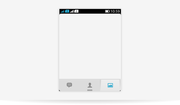
Category bar
- Provides quick acces to distinct areas, modes or views or to elementary functions of an application.
- Can contain maximum 4 tabs or actions.
- Can only have icons.
See Category bar for more information.
Check box
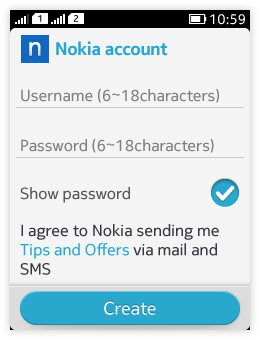 |
See Switches - check box for more information. |
ComboBox
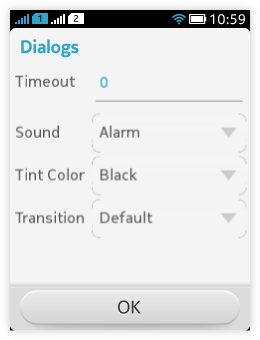 |
See Pickers for more information. |
DatePicker
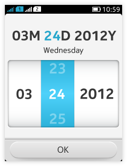 |
See Pickers for more information. |
Label
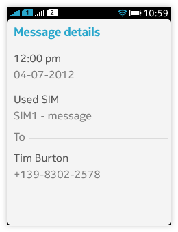 |
See Text fields for more information. |
Slider
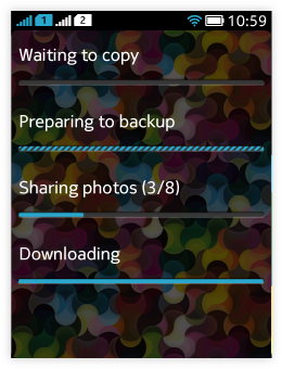 |
Used for setting values from a continuous range or for showing progress if there is something in the view the user has to wait for. See Sliders and Progress indication for more information. |
Spinner
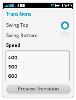 |
Offers a simple way to select values. Consists of:
If the Spinner is used within a Form, no explicit confirmation is needed, the selected value is automatically saved. See Pickers for more information. |
Tabs
 |
Tabs provide quick access to distinct areas, modes or view of an application.
Tabs can be freely customized for branding. See Tabs for more information. |
TextField
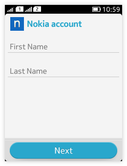 |
Textfield is used for entering or editing text. It is simple, single line component. See Text fields for more information. |
TextArea
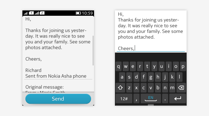
Used for entering or editing text.
3 different modes:
- Normal
- Active
- Error
- Labels
- On-screen keyboard
- Placeholder (hint) text
See Text fields for more information.
Table
- Editable grid component with variable sizes for its entries.
- Entries can be editable or not.
TimePicker
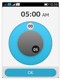 |
See Pickers for more information. |
Tree
- For representing a hierachical view of data, such as a file system.
UnitPicker
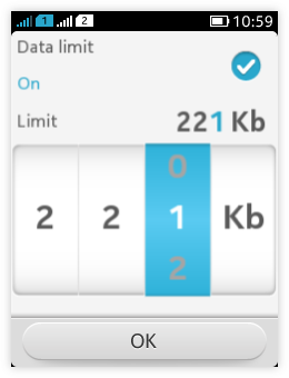 |
See Pickers for more information. |