UX guidelines
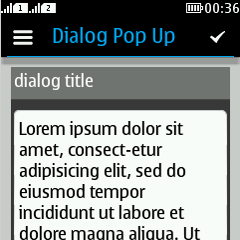
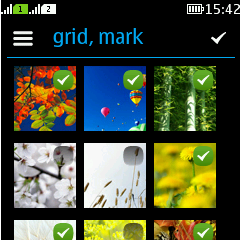
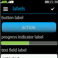
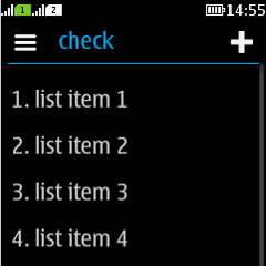
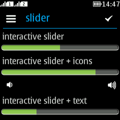
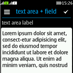
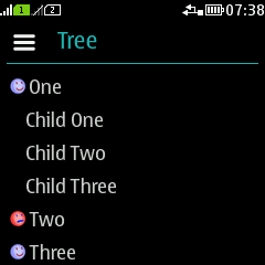
This UX guidelines describes the LWUIT components. Some of the components are not yet styled for Series 40, some might miss some computational logic. However, this section describes how a component should behave or how a component should be adopted in case it is used with Series 40 phones. Most of the layouts shown in these pages are sketches. For the most up-to-date information and images of the components, please visit the online version of this library.
For the UI patterns, please see:
